Quasimodo's Jungle Jeopardy - update

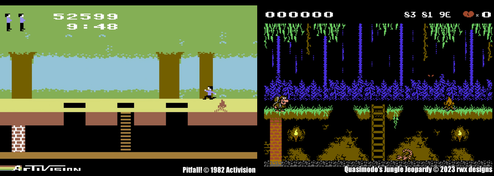
As work continues on my re-imagined Pitfall! game, did you ever wonder or notice why the fire sprite is stripey in the original C64 Pitfall! (see screenshot below left) version? Well, you may think it's a bug - but actually it's an oversight/mistake when the sprite graphics were being designed. The multicolours/sprite colours were assigned wrongly, this is why there are black crocs/aligators and not green ones. When it came to the fire sprite in multicolour mode - it didn't look anything like it should in terms of colour, so they switched it to a hires sprite and set it to red, rather than re-work all the sprites in the correct colour assignments. You notice these things more when looking at the game in detail. Thankfully, when designing a game from scratch you don't have to worry about such mistakes.
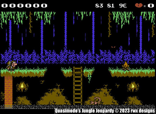
No timescales for my version with Quasimodo and when it will be completed, but it's an interesting project to work on. The limitation of characters in EBC mode is also an interesting test. 64 characters was too limiting however, so I've used two character sets for the game - one for the jungle canopy and one for the underground. This makes collision work more interesting and there are still going to be some additional challenges to work out going forward. A few more additions have been incorporated since the Preview 2 video as you may spot from the screenshot below right. Quasimodo is now walking and jumping around. I just have to complete work on his falling animation frame with his Indiana Jones style hat and his climbing ladder animations. Did I mention he will be able to throw objects in this version of the game? Well, now you know!
Hopefully, I will have Preview 3 ready by the end of the month. ![]() 🦂
🦂

Quasimodo's Jungle Jeopardy
A re-imagined version of the classic game Pitfall! for the Commodore 64
| Status | In development |
| Author | rwx designs |
| Genre | Platformer |
| Tags | Commodore 64, designs, jungle, pitfall, quasimodo, rwx, Singleplayer |
Comments
Log in with itch.io to leave a comment.
Lovely Stuff ! Very Exciting to see you Working on another Game ! Like C64 Mat I am a Huge Fan ( Us Yorkshire Men proper Stepping up to give you Mega Support :-> )
Wayne
As always, I follow your progress with keen interest. I particular like the graphics for the torches on the rear walls - The way they appear to light up the rocks surrounding them. It's a great touch. Looking forward to seeing it all moving together!